





Phone:
+86-18513327189

The difficult part of working with data does not always end when the analysis is complete. A report may reveal a clear trend, an unexpected gap, or a relationship between several variables, yet those findings can remain surprisingly difficult to communicate. Tables can preserve every value, but they do not necessarily show which relationship matters most or where the viewer should look first.
This is the point where data visualization design becomes part of the analytical process rather than a final layer of decoration. The design determines how findings are organized, what receives visual emphasis, and how much context the audience needs before a pattern becomes understandable. A useful visualization does not simply make data look more attractive; it gives the information a structure that people can follow.
The connection between analytics and data visualization is especially important when the audience is not made up of data specialists. Executives, customers, internal teams, and general viewers may need to understand an analytical finding without examining the underlying dataset themselves. Turning that finding into a clear visual story requires decisions about charts, graphics, typography, color, motion, hierarchy, and narrative flow.
Before deciding whether a dataset should become a bar chart, line graph, infographic, dashboard, or animated sequence, there is a more fundamental question to answer: what is the analysis actually saying?
A useful visualization starts with the finding rather than the format. A set of numbers may show a change over time, a difference between groups, a relationship between variables, an unusual outlier, or a distribution that would be difficult to recognize in a table. Each situation calls for a different visual approach.
This is one of the most important principles in data visualization design. The chart should serve the information, not the other way around. Choosing a familiar chart simply because it is available can produce a technically correct graphic that still fails to communicate the central finding.
Context matters just as much. A percentage without a reference point can be difficult to interpret. A sudden increase may appear significant until the viewer learns that the underlying volume is relatively small. A decline may look alarming without knowing whether it follows a predictable seasonal pattern.
Good analytics and data visualization work keeps these relationships visible. The objective is not to remove complexity simply because it makes the graphic harder to design. Instead, the design should reveal the structure already present in the analysis.
This also means understanding the intended audience. A specialist may immediately recognize a statistical pattern, while a general viewer may need a short explanation, annotation, or visual comparison. The same analytical result can therefore require different presentations depending on who needs to understand it.
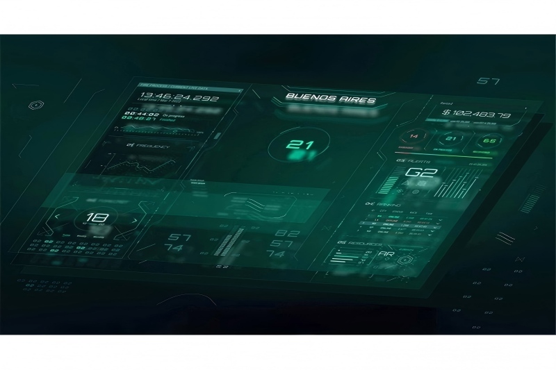
Once the main finding is understood, the next challenge is deciding what should receive visual emphasis.
Data-heavy visuals often fail because everything is treated as equally important. Every number is large, every category has a strong color, and every label competes for attention. The result may contain plenty of information while providing little guidance.
Effective data visualization design creates a visual hierarchy. The primary finding should be easy to identify, while supporting information remains available for people who want more detail.
Position is one way to establish that hierarchy. Size, spacing, contrast, typography, and color can reinforce it. A headline figure might occupy a prominent position, while supporting metrics sit around it. An annotation can explain an unusual point without forcing the viewer to search through a separate paragraph.
Color should also be used deliberately. If every category receives a bright, contrasting color, the graphic may become difficult to interpret. A more restrained palette can allow one important category, change, or finding to stand out without making the rest of the information disappear.
Typography plays a similar role. A strong typographic structure can distinguish the main conclusion from supporting labels and explanatory text. This becomes particularly useful when visualizations need to communicate information quickly.
For teams working with analytics and data visualization, this hierarchy reduces the amount of mental effort required from the viewer. Instead of asking people to determine what matters from a collection of equally prominent elements, the design provides a clear starting point.
Charts are an essential part of data communication, but not every analytical finding needs to be presented as a conventional chart.
Sometimes a chart is the clearest option. A comparison between categories may be easier to read through bars, while a trend across time may benefit from a line. But when the goal is to explain a process, relationship, or sequence, a diagram or animated visual may communicate more effectively.
| Visual Approach | What It Can Communicate | Where Design Matters Most |
|---|---|---|
| Bar or column chart | Differences between categories or values | Scale, ordering, labeling, and visual emphasis |
| Line chart | Changes across time or another continuous sequence | Time scale, trend visibility, and line clarity |
| Scatter plot | Relationships between two or more variables | Context, scale, clustering, and outlier treatment |
| Diagram | Processes, relationships, structures, and connections | Spatial organization and clear visual relationships |
| Infographic or explanatory graphic | Key facts combined with supporting visual information | Hierarchy, sequencing, typography, and narrative flow |
| Animated visualization | Change, movement, sequence, or transformation | Timing, pacing, transitions, and controlled emphasis |
The decision should be based on what the audience needs to understand. A sophisticated visualization is not automatically a better one. In many cases, a simple graphic that makes one relationship obvious is more effective than an elaborate composition containing several competing ideas.
This broader approach also gives analytics and data visualization more flexibility. Data can be presented through a combination of charts and explanatory visuals when a single format cannot communicate the entire idea clearly.
For example, a chart might establish a performance trend, while a supporting graphic explains the factors contributing to that trend. In an animated presentation, the same relationship could be introduced gradually so the audience sees how one finding connects to the next.
The goal remains the same: select the visual form that makes the analytical relationship easiest to understand.
Design choices can affect interpretation even when the underlying numbers remain unchanged. Color, typography, scale, movement, and composition all influence what viewers notice first and how they understand relationships.
Color is particularly powerful. A contrasting color can draw attention to a specific value. A consistent color can help viewers recognize the same category across several visuals. A carefully selected palette can also establish a visual system that remains recognizable across an entire presentation or campaign.
However, color can also create misleading emphasis. If several categories receive equally strong visual treatment, the audience may assume they have similar importance. If one category is given an intense accent without a clear reason, viewers may interpret that category as more significant than the data actually indicates.
Typography contributes to the same hierarchy. A large statement can establish the main finding, while smaller supporting text provides context. Consistent type treatments can also make several visualizations feel like parts of the same system.
Motion introduces another consideration. In static data visualization design, the viewer controls the pace of exploration. In an animated visualization, the designer can guide attention through timing and movement.
A gradual reveal can show how a trend develops. A moving highlight can identify an important change. A transition can connect one analytical finding with another. An animated diagram can explain a process that would otherwise require several static illustrations.
But motion should not exist simply because animation is available. If every element moves simultaneously, the viewer may have difficulty identifying the information that matters. Motion is most useful when it has a clear relationship with the data or the narrative.
Firefish Studios works across visual communication disciplines where design, animation, motion, and storytelling can intersect. Its capabilities provide an overview of the creative approaches available for projects that need to turn information into more engaging visual experiences.
One of the biggest challenges in data visualization design is deciding how much information to show.
Removing every secondary detail may produce a clean-looking graphic, but it can also remove the context needed to interpret the main finding correctly. On the other hand, showing every available variable can create a visual that is technically comprehensive but almost impossible to read.
A layered structure provides a practical middle ground. The first visual layer communicates the central idea. Supporting elements explain the surrounding context. Additional information can be presented through annotations, secondary views, labels, or interactive elements where appropriate.
This approach is particularly useful when analytics and data visualization are intended for different types of viewers. A decision-maker may want to understand the main trend quickly, while an analyst may need more detail to examine the underlying relationships.
Good design does not have to choose between these audiences. It can create a clear entry point while preserving the information needed for deeper exploration.
Annotations are often useful for this purpose. Rather than forcing the audience to interpret every unusual point independently, a short explanation can identify an important event, clarify a comparison, or explain why a particular value deserves attention.
The key is to simplify the experience rather than distort the data. The viewer should come away with a clearer understanding of the finding, not an easier but inaccurate version of it.
A single chart can communicate a single finding. A larger analytical project usually needs to communicate several findings and explain how they relate.
This is where visual storytelling becomes important. Imagine a presentation containing five accurate charts. If each chart uses a different color system, layout, typography, and visual logic, the audience may have to start learning how to read the presentation again with every new screen.
A coherent visual system removes that friction.
Consistent typography, spacing, color treatment, annotation styles, and graphic structures help viewers understand that different findings belong to the same story. Once that foundation is established, individual visualizations can still have their own characteristics.
The sequence matters as well. One finding can establish the current situation. Another can reveal a change. A third can provide context for that change. Later visuals can bring those observations together.
This is not about forcing every analytical project into a dramatic narrative. It is about giving the audience a logical route through the information.
In data visualization design, this means considering the relationship between visuals rather than focusing exclusively on individual charts. A presentation, report, dashboard, or animated sequence should feel like one visual system.
Motion can be particularly effective when several insights need to be connected. Instead of abruptly replacing one visualization with another, a transition can show how the two findings relate. An element can move from one position to another, or a visual layer can gradually change to introduce the next point.
That approach can make analytics and data visualization feel less like a collection of separate facts and more like a structured explanation.
Data visualization design is not simply the process of making analytical information look polished. It is the work of deciding how data should be organized, emphasized, explained, and experienced by the people who need to understand it.
The strongest visualizations begin with the analytical finding. From there, the designer can determine which information deserves attention, whether a chart is the right format, how color and typography should establish hierarchy, and whether motion can help explain change or relationships.
The relationship between analytics and data visualization becomes especially valuable when complex findings need to reach audiences beyond data specialists. A well-designed visual can preserve important context while giving viewers a much clearer route through the information.
Ultimately, effective visualization is not about adding complexity to make data appear more sophisticated. It is about removing unnecessary friction between the finding and the person trying to understand it. Sometimes that requires a simple chart. Sometimes it calls for an explanatory graphic, an animated sequence, or a combination of visual techniques. The right choice is the one that makes the underlying story clearer without changing what the data actually says.
If your organization needs to turn complex analytical findings into a visual presentation, animated sequence, or broader communication experience, the creative approach should be considered alongside the data from the beginning. To explore how Firefish Studios could support a project involving data visualization, animation, motion, or visual storytelling, you can contact Firefish Studios with your project requirements.
Data visualization design is the process of organizing data into visual forms that help people identify patterns, comparisons, relationships, and important findings more easily.
Analytics and data visualization work together by turning analytical findings into visual representations that make those findings easier for different audiences to understand.
No. Charts are useful for many analytical tasks, but diagrams, graphics, annotations, animation, and other formats can be more appropriate depending on the information being communicated.
Color can establish hierarchy, distinguish categories, highlight important findings, and maintain consistency across a group of visualizations when applied deliberately.
Yes. Animation can communicate change over time, explain processes, direct attention, and connect related findings when movement has a clear informational purpose.
Use visual hierarchy and layered information to emphasize the main finding while retaining the context and supporting details necessary for accurate interpretation.